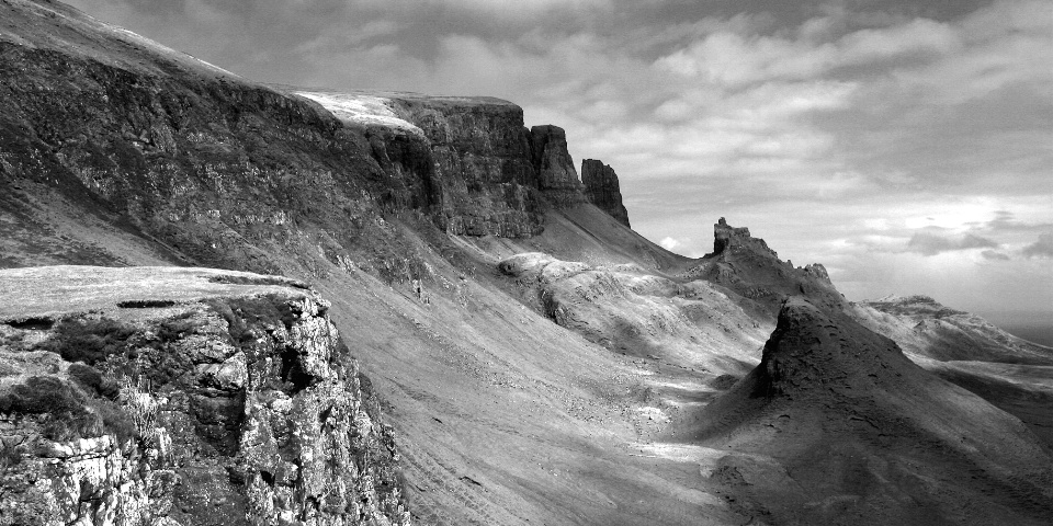
The Quirang II

Uploaded: June 04, 2005 13:26:20
F10, 1/125s, Sigma EXDG 28-70mm @28mm, ISO 100, Shot in RAW.
Location: Isle of Skye, Scotland.
Date: 15/4/05 approx 2:30pm.
Converted to TIFF and tweaked curves and levels a little.
Used Channel mixer in PS8 boosting Red Ch 35%, Green Ch 10% and
knocking back Blue Ch 8% to achieve a slightly infra-red effect.
I then cloned out a few 'Wooly-backed Haggis' in the lower right
area as these appeared as 'dust specks on a neg'.
The Quirang is a complex series of basalt crags and stacks towards the northern end of the Trotternish Ridge on the Isle of Skye. The Eastern Slope of which is an ancient and massive landslip (20 miles long). At its southern end is the more famous stack The Old Man of Storr.
Grant Campbell June 05, 2005 0
Feel free to deconstruct my efforts and give your opinion on artistic or technical points.Terry R. Hatfield June 05, 2005 0
Hi Grant Im Not Much For B&W Images Either,This One Has Nice Comp And Tonal Range And That Dramitic Sky Looks Great!The Other Image Lacks Impact This Ones Holds Your Attention Much Better,Great Job:-) #1432040Pam M June 06, 2005 0
Okay Grant ... If I tell you why I suspect this one works and the other one doesn't, can we see the color one?It seems that those of us who read from left to right read photographs in the same way. This image makes strong statements on the left intro to the photo ... the other doesn't.
In this image, the topology is very clearly understood throughout the whole image. The other one looks like cloud shadows made their own imprints and it's difficult to separate depth from shadow.
This image ends on the right with a very clear understanding of depth and subject. The other one is muddled (again I think it's clouds).
Also, in the other image, the so so entry on the left combined with the muddled exit on the right combines to effectively put the subject totally within the "frame" of the pic. The brain is therefore satisfied that that's all there is and is not intrigued to wonder anything more about the image ... thus the loss of attention.
ok so ... now ... stop teasing this flatlander and let me see the color ... please :-D
have fun,
pam
#1438223
Rosemary Buffoni June 07, 2005 0
Very interesting discussion going on. I like this one the best-it has good compositional flow thru the image caused by the diagonal flow from strong forground thru the curved center into the lighter (than the other) sky. I feel as if this image goes on forever-whereas the other ends abruptly for me. The tones are also great in this one.Grant Campbell June 07, 2005 0
Ok, Ok, I give in!!! lolPam M June 08, 2005 0
ok well ya'll can sit and admire the mono alllll you want to ...I'm going to admire the color one. i've gone from why the heck would I wanna be there? to can I please come visit?See you know what the place looks like. I don't. I find the mono to be harsh, barren and very an upealing. I thought I was looking at a desert land! I don't know how in the world you could have done to have changed that.
Yeah, do that ... go back and stand in the pic ... I am getting a better idea of depth with the color ... but yeah a person in the pic would help ... (there, now you have an "excuse" to go back) #1446534
Grant Campbell June 08, 2005 0
Oh well, you know what they say: "You can please most of the people most of the time, but you can't please all the people all the time!"Doug K. Herrman June 10, 2005 0
and for a totally different view...my eye feels the rock in the lower left is out of place here: 1) it is highly contrasty, while the rest of the image is mellow mids. Because of the high visual nature of the rock, it is dominating the image. 2) the right side has an soft, etheral feel, like a moonscape - but the rock is very real and quite hard. I would crop the rock out. Great shot, Grant and I envy you for being in such an exotic place. #1452431Kerby Pfrangle July 25, 2005 0
GrantCongratulations on your second place win.
Job well done and beautiful image.
KErby #1634425
KHAWLA Haddad July 25, 2005 0
Congratulations on this beautiful winner!!! #1635733Ken Grooms July 25, 2005 0
I dream of taking a picture loke this! Congratulations! #1637586Sharon Day July 26, 2005 0
Fantastic image, Grant!!! Big congratulations! #1638161Sign up for an interactive online photography course to get critiques on your photos.
Discussions by Category: You can view photo discussions on various themes in the Community > Photo Discussions section of the site.
BetterPhoto Websites: If you see an orange website link directly under the photographer's name, it's totally okay. It's not spam. The reason: BetterPhoto is the one that offers these personal photography websites. We are supporting our clients with those links.
Unavailable EXIF: If there is no other information but 'Unavailable' in the EXIF (meaning no EXIF data exists with the photo), the 'Unavailable' blurb is not displayed. If there is any info, it shows. Many photos have the EXIF stripped out when people modify the image and resave it, before uploading.
The following truth is one of the core philosophies of BetterPhoto:
I hear, I forget.
I see, I remember.
I do, I understand.
You learn by doing. Take your next online photography class.
Copyright for this photo belongs solely to Grant Campbell.
Images may not be copied, downloaded, or used in any way without the expressed, written permission of the photographer.
Log in to follow or message this photographer or report this photo.

I already have an account!


