|
- david H. casian  Contact david H. casian david H. casian's Gallery |
Getting an opion
|
|||||||||||||||||||
|
|
||||||||||||||||||||
|
Lori Carpenter |
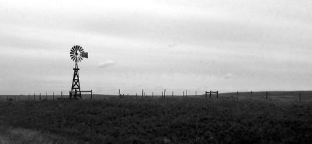
David, I really like the B&W Windmill picture. I think taking classes would be a great idea to hone your abilities. I've been thinking of signing up for a few here myself just for the same reason.
|
|||||||||||||||||||
|
|
||||||||||||||||||||
|
Shauna Linde |
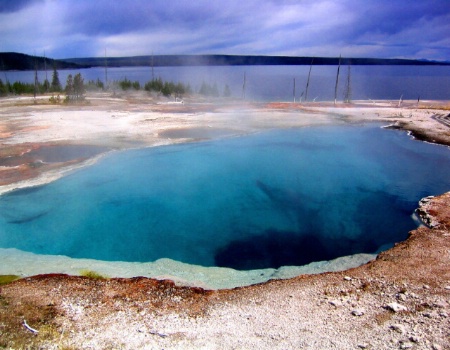
Hi David! I too really like the Windmill picture- it's composition is very pleasing to the eye. The other pictures have great use of color as well. The picture titled "Abyss"- where was that shot at? It looks similar to some I have taken at Yellowstone National Park. Posting pictures here is one great way to get people to give you their thoughts and critique- If you have the time you should check out your library, or a good bookstore's photo section for more ideas/helpful hints. You've got some good talent forming!
|
|||||||||||||||||||
|
|
||||||||||||||||||||
|
- david H. casian Contact david H. casian david H. casian's Gallery |
Thank you very much for your comments, the abyss picture was taken at yellowstone it is sometimes hard to know if your improving with photo styles with out hearing from other points of view, I hope you will continue to view my stuff and give me you opions good or bad....this is the best way I can think to continue to grow, again thank you!
|
|||||||||||||||||||
|
|
||||||||||||||||||||
|
John P. Sandstedt |
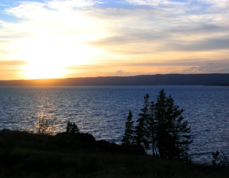
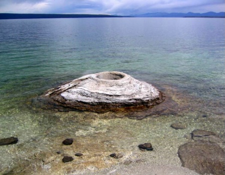
Find a good camera club and enter your images in its competitions. As to the images you posted, there is a common error in all of them. You subjects are either poorly defined or, the images provide no real zing to make them standouts. Let's talk about each individually. Waiting: Good image but, in some respects, lifeless. To much dark foreground adding little to the over all image. A rule I was taught, emphasize the significant parts of the image, crop the distractions. Days End: Sun very irritating, piercing the eye. Not enough emphasis on clouds, that is contrast. Perhaps a polarizer might have helped, if you didn't use one. Nature's Fury. not sure of the subject here. certainly there ar eno leading lines to help draw attention across the distressed landscape. I think the image is dull. Abyss. you've cut off a portion of the abyss. This is disturbing. Breaking Point. I don't understand the Title. I don't see what it is you're trying to show your audience. There are no people and little to give the viewer a sense of size, splendor or lack thereof. You nee something to raise expections, a person wearing a red hat and jacket - just something to give "almost" pictures the boost to better of great images.
Hope this helps. Keep shooting. john
|
|||||||||||||||||||
|
|
||||||||||||||||||||
|
- david H. casian Contact david H. casian david H. casian's Gallery |
John Thanks for the opions good advise helps, what club do you belong to? and how do I get info on' joining
|
|||||||||||||||||||
|
|
||||||||||||||||||||
|
This old forum is now archived. Use improved Forum here
Report this Thread |
||||||||||||||||||||