The following is intended to help budding photographers understand why some photos win photography contests and others don't. These guidelines consist of a brief introduction into the judging criteria that we use here for the photography contest at BetterPhoto.com. They are by no means comprehensive. But they should give you a start in the right direction.
 © Colleen Walsh |
Our judging process is composed of multiple stages and calls upon the evaluations of a panel of skilled photographers and judges. So many excellent entries are submitted to the contest each month, we have to be brutal. The voting process unfortunately eliminates many good images.
The winning photographs you see posted on the site feature a strong combination of the assets we seek in an image. These include: thoughtful attention to lighting, eye-catching color; balanced composition; sharpness; correct exposure; and a host of other elements. An explanation of our judging criteria - used as a guideline during the voting process - follows.
 © Danny Verhasselt |
Therefore, if you enter many images consecutively, only the first is judged
in the contest. We regretfully pass over many great images each month because the
contestant obviously had not read this part of the rules.
 © Lisa Young |
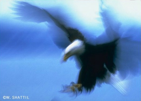
We generally notice two levels of blur in the images submitted:
 © W.J. Shattil |
Is it underexposed? Is the snow blue instead of white? Is the image faint and hard to see? Does it look like it may have been a nice image before it was poorly scanned?
Does the photo show pleasing colors with clarity and correct exposure? Can you make out the details in the shadows. Clarity and resolution of the photo - being able to enjoy the details of an image - mean a lot to the judges. They look at how well exposed the image is and, unless the photo is black and white, how well color is captured.
 © Darwin Wiggett |
Learn how to do a slight amount of digital sharpening after you scan, with a image-editing program such as Adobe Photoshop; investigate the "Unsharp Mask" or "Smart Sharpen" functions in your software.
You should especially be careful to not overly compress a JPEG file when saving. We recommend uploading images with the least amount of compression as your connectivity can allow - if you are on slow connection, you may not be able to wait for a big file to upload. In any case, settings above 8 (or 80% or the equivalent in your software) are generally safe.
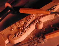 © Guy Biechele |
Also, make sure that you scan the area of your image and not its surrounding borders. Try to not be overly concerned about getting every single square millimeter of your picture, to the point where you actually end up including white or dark lines around the photo. If you do, crop them before submitting the photo.
This is all about the art of seeing - of being able to creatively notice the right moment - as well as artistic treatment. A high voting score here represents an artist who is aware of the unique colors and qualities to be found in light, as well as noticing graphic elements such as lines, patterns, shapes, and forms.
Noticing and capturing the comical and humorous can also be helpful. Finding an interesting, unique and original choice of subject, and going out on a limb, will often result in some of the best pictures.
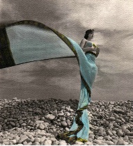
©Paolo Cardone |
Consider the overall clarity of meaning and focus of statement. When the photographer's intention is clear and the main subject obvious, this can help make the photo a winner.
Lastly, the photo should be balanced in composition (e.g. by use of the Rule of Thirds or another compositional principle). Move in closer if you need to. Make sure the horizon is level. Whenever possible, eliminate any extraneous elements - such as annoying spot of glare, an unwanted tree branch or camera strap. For more hints on what makes a good photo, review our Top Ten Tips.
1) The judges have generally learned to dislike borders. Borders are all too often placed around mediocre photos in an attempt to "dress them up". If you are considering a border, do what the judges do: examine the photo itself, critically and exclusively. Hold up your hands and use your fingers to temporarily hide the borders. If the photo does not stand on its own - without borders, then don't add a border.
2) We certainly support putting your own copyright symbol on your photos. However, if you are going to do this, try to keep the signature and copyright symbol from becoming too distracting. One trick is to color your font so that it works harmoniously with the other colors in your photo. Help your viewer keep his eye on your main subject.
Remember that you have a lot going for you at the BetterPhoto contest. Our judges are dedicated to three things:
Overall, we are looking for beautiful, truthful, and creative images.
Thank you for your interest and enjoy the BetterPhoto.com Photo Contests.