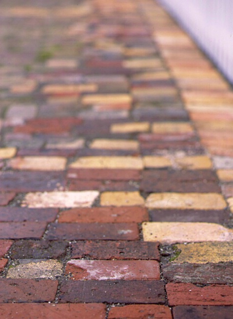
Walking on Colors

Uploaded: September 10, 2002
Brick Sidewalk in the San Juans
Great shot
Thomas #56911
Leanne M.E. Boyd October 08, 2003
Excellent shot, Denise - I like the texture and colour. I can see what Thomas is saying though. Unless of course a shallow dof is what you were going for. Good work!!! #225468
Denise Miotke
 February 20, 2004
James A. Zoglmann March 03, 2004
Denise, I agree with you on this...if you had shown the whole sidewalk in focus, it would have just been a nice shot of a sidewalk. The focus on a shot like this is EVERYTHING!! Just my opinion. #405796Wayne Nolting July 06, 2004
It's amazing how a simple subject properly composed can stand out so well. Perhaps a little more depth of field as mentioned above would help but the "blur" is still needed for a "fade-out" effect. Nice colorful shot #634754Sign up for an interactive online photography course to get critiques on your photos.
Discussions by Category: You can view photo discussions on various themes in the Community > Photo Discussions section of the site.
BetterPhoto Websites: If you see an orange website link directly under the photographer's name, it's totally okay. It's not spam. The reason: BetterPhoto is the one that offers these personal photography websites. We are supporting our clients with those links.
Unavailable EXIF: If there is no other information but 'Unavailable' in the EXIF (meaning no EXIF data exists with the photo), the 'Unavailable' blurb is not displayed. If there is any info, it shows. Many photos have the EXIF stripped out when people modify the image and resave it, before uploading.
The following truth is one of the core philosophies of BetterPhoto:
I hear, I forget.
I see, I remember.
I do, I understand.
You learn by doing. Take your next online photography class.
Copyright for this photo belongs solely to Denise Miotke.
Images may not be copied, downloaded, or used in any way without the expressed, written permission of the photographer.
Contact photographer via gallery
Log in to follow or message this photographer or report this photo.

I already have an account!
