
The Blues
Uploaded: September 19, 2004 01:37:57
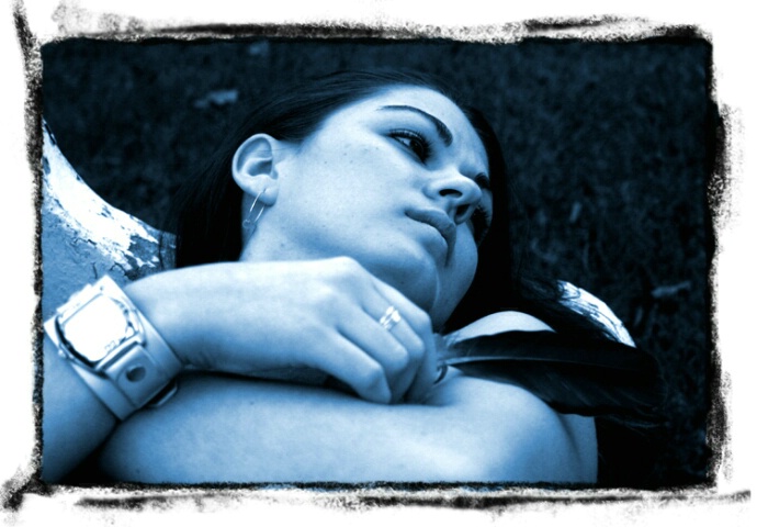
F5.6 1/320s ISO200. Photoshoot of a friend, colorized in photoshop. I had made up the polaroid transfer edge in photoshop a few weeks ago and really like the look of it. Funny thing is that I didn't know what this month's theme was until I was about to upload this shot, good thing I checked before I selected the category!
Let me know what you think of the shot.
James
Dorothy Neumann September 19, 2004
I like the mood conveyed in this, but I think your friend's watch is quite distracting. #170322James P. Hildebrandt September 19, 2004
I agree, I didn't really notice it until I was going through the pictures on the computer. Oh well, lesson learned
James #790376
Leanne M.E. Boyd September 19, 2004
Cool shot, James! #790656Cindy Paquette September 19, 2004
I think your shot is very creative with those polaroid edges and the blue on your model. Love that look on her face. However, I so do agree with Dorothy, that watch is distracting!Emily C. Barker September 22, 2004
Excellent shot, except I don't like the blue. I work in an ER and to me, it looks morbid. Sorry. Glad that no one else seems to have the deviated thought process! #798786James P. Hildebrandt September 22, 2004
That's probably the last comment I would have expected :) I never thought of it as morbid but I guess I can see it if you work in an ER. It's always interesting to see how different people view the same picture.James #799051
Emily C. Barker September 23, 2004
Can you post one on this comment page in real color? I really like her expression and I think it would look awesome just normal colors. #799994Nancy Grace Chen October 15, 2004
I think this is a great shot with lots of potential... I really like the natural expression, pose, and angle here. I think this would look great in sepia, and with some care you may even be able to clone out the watch in PS. Nevertheless, a very artistic portrait. Congrats on your finalist.Nancy #846323
James P. Hildebrandt October 16, 2004
Thank you Nancy, it's funny that you mentioned the sepia because that was the first thing I tried when I got it out of the camera and onto my computer. I'm a big fan of sepia but I started thinking that maybe I was using it too much so I figured I'd try something different and I added the blue. I'll attach the original uncropped shot in sepia. Also to Emily, I'm sorry but I don't have the colour version of this shot on this computer (it's on my better computer which I keep disconnected from the internet for ultimate virus protection), I'll try and upload it sometime though.Thanks again for your comments. #846848
Emily C. Barker October 16, 2004
James, I love the Sepia! Looks great! It has a completely different feel to it. Nice work!Sign up for an interactive online photography course to get critiques on your photos.
Discussions by Category: You can view photo discussions on various themes in the Community > Photo Discussions section of the site.
BetterPhoto Websites: If you see an orange website link directly under the photographer's name, it's totally okay. It's not spam. The reason: BetterPhoto is the one that offers these personal photography websites. We are supporting our clients with those links.
Unavailable EXIF: If there is no other information but 'Unavailable' in the EXIF (meaning no EXIF data exists with the photo), the 'Unavailable' blurb is not displayed. If there is any info, it shows. Many photos have the EXIF stripped out when people modify the image and resave it, before uploading.
The following truth is one of the core philosophies of BetterPhoto:
I hear, I forget.
I see, I remember.
I do, I understand.
You learn by doing. Take your next online photography class.

Copyright for this photo belongs solely to James P. Hildebrandt.
Images may not be copied, downloaded, or used in any way without the expressed, written permission of the photographer.
Log in to follow or message this photographer or report this photo.
I already have an account!