Uploaded: January 01, 2009 10:41:40
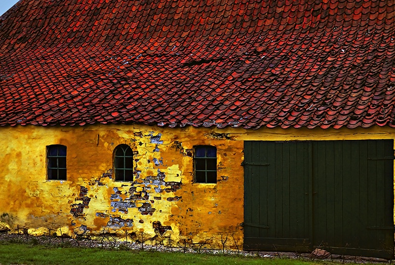
Rural Denmark. This barn was built long ago, but only time could create this design. I don't think it could be duplicated. Reworked with Nik Efex. (EofD)
Exif: Model: Nikon COOLSCAN V ED
Steve M. Harrington January 01, 2009
Should the sky in the corner be cropped? Does it add context or distract? Thanks for your opinion. #1059960Ron McEwan January 01, 2009
Nice work Steve, when I was in Denmark there was no such thing as digital or whats a PC anyway. Nice image for sure here. #6967314Dale Hardin January 01, 2009
Love this texture and the capture Steve. The colors are fantastic.Your question is a hard one because there are so many good crops available here. To me the sky is not as much an issue as the sliver of yellow on the right side of the door.
I think my favorite crop would be to leave the sky to define the roof line and crop the right side about 1/2 way into the center of the large doors. Drop the top just a little but leave the sky. #6967438
Steve M. Harrington January 01, 2009
Thanks a lot, Dale. When I entered this before I cropped the sky, but I didn't like the windows being moved left. I'll have a look at that sliver on the right. Decisions decisions... :)Melissa Olsen January 01, 2009
Outstanding color and work. #6967476KARU WIJESUNDARA. A.N.P.A.S. January 01, 2009
VERY COLOURFUL IMAGE STEVE!HAPPY NEW YEAR!
KARU. #6967742
A P January 01, 2009
wonderful textures, Steve #6968201Mary Beth Aiello January 01, 2009
Wonderful comp and colors, Steve. Love it. #6968641Colleen Farrell January 01, 2009
LOVE it!! #6969180Patti Coblentz January 02, 2009
Time is a marvelous choreagrapher of design, particularly in this instance. The colors and textures are wonderful, and the sky gives it dimension. I say leave the sky...in my humble opinion. Beautiul image!Deb Koskovich January 02, 2009
A wonderful image with fabulous textures, Steve. I agree about the yellow sliver on the right, I would get rid of that. As for the sky, I really love the play of blue against the other colors, but there isn't really enough of it to lend a sense of perspective to the shot. Does the original have more sky, by any chance, or is this all that was in the image to begin with? I would love it if it were larger, but as it is here -- I believe I would crop if it were me. But I do love this shot, the colors just pop! #6971839Steve M. Harrington January 02, 2009
Thank you all for your nice and thoughtful comments. Composition is to me always a fascinating issue. Here is the cropped version. It is a very different image in feel and effect, I think. I am still partial to the more "expansive" original, including the slight yellow on the right, but I am open to persuasion. :) There is no more sky to be added; the original is uncropped. Btw, it was a gray day originally.Tammy Espino January 02, 2009
Everyone will always have a different opinion of what they like,so I say do what you like! lolSteve M. Harrington January 02, 2009
You can count on me doing what I like, but what I like can change with the thoughtful suggestions of friends. :) Thanks, Tammy.Rebecca K. Lefferts January 02, 2009
Wow- awesome building. Beautiful shot, great colors, nice work Steve! #6972069Dale Hardin January 02, 2009
Hard to go wrong with this material Steve but I prefer the original with the sky. Still like it better without the sliver though.Very impressed with your willingness to try suggestions. I admire that. #6972368
Steve M. Harrington January 02, 2009
Thank you, Rebecca and Dale. I still kinda like my sliver holding the door in the image, but it may well draw the eye too much. I am impressed with your willingness to make suggestions, Dale. We need more of that at BP.Mitch Spence January 05, 2009
Hi, Steve. Yeah, I'd certainly agree about that yellow sliver. I like the sky, I like the detail. I adore that rock in front of the doors (how can they open them up with it there?). The image is, to my taste, over-saturated. But we have an ongoing "thing" about that, I know, and I am the odd-woman-out about that generally. I've become more of a fan lately of square crops, and I might try that here, really "squarish" and not necessarily really square, retaining the blue sky and taking off some of the dark doors area at right. I have to see it to know though, and it might very well all be hogwash. #6985620Steve M. Harrington January 05, 2009
Thanks for your thoughtful comments, Mitch. I am afraid I will remain incorrigible in the saturation department. :)Mitch Spence January 05, 2009
Yep, for me it's better this way, Steve. I still feel that the dark door area is too dark. I would, ideally, like a bit more detail in it and a bit lighter. Possible? #6986407Steve M. Harrington January 05, 2009
Like this? A quick change with Viveza. I kinda like your suggestions, Mitch! Pretty good for an odd woman. :)Mitch Spence January 05, 2009
I like it, Steve. I especially like that half door. What do you think? #6986947Steve M. Harrington January 05, 2009
I think you have found a fine solution, Mitch. I uploaded your version on Facebook just now. Thank you again. #6986968Dale Hardin January 07, 2009
I like this last posting and the lighter doors work well also. #6997650Steve M. Harrington January 07, 2009
I do too, Dale. Mitch hit on a fine solution. I already entered the original, so we shall see. :) #6997727M.Christine Duncan February 23, 2009
CONGRATS Steve! A wonderful finalist, you've always had an eye for detail within a grand composition! #7198317Tammy Espino February 23, 2009
Congrats!! :) #7198533Mitch Spence February 23, 2009
Hey, Steve. Good stuff. Congratulations to you. #7198604Phil Stith February 23, 2009
Kudos for another terrific finalist! #7198698Dale Hardin February 23, 2009
WTG Steve. Loved this image from the start. Congratulations on the award. #7202606Michelle Alton February 23, 2009
Another wonderful finalist, Steve. Don't know how I missed this one before.Mike D. Perez February 23, 2009
Great testure and colors, Steve! Congratulations! #7204522Usman M. Bajwa February 23, 2009
Great shot, Steve. CONGRATULATIONS on this amazing Finalist.Usman. #7205169
Steve M. Harrington February 24, 2009
I want to thank you all so much or your nice comments!Sign up for an interactive online photography course to get critiques on your photos.
Discussions by Category: You can view photo discussions on various themes in the Community > Photo Discussions section of the site.
BetterPhoto Websites: If you see an orange website link directly under the photographer's name, it's totally okay. It's not spam. The reason: BetterPhoto is the one that offers these personal photography websites. We are supporting our clients with those links.
Unavailable EXIF: If there is no other information but 'Unavailable' in the EXIF (meaning no EXIF data exists with the photo), the 'Unavailable' blurb is not displayed. If there is any info, it shows. Many photos have the EXIF stripped out when people modify the image and resave it, before uploading.
The following truth is one of the core philosophies of BetterPhoto:
I hear, I forget.
I see, I remember.
I do, I understand.
You learn by doing. Take your next online photography class.
Copyright for this photo belongs solely to Steve M. Harrington.
Images may not be copied, downloaded, or used in any way without the expressed, written permission of the photographer.
Log in to follow or message this photographer or report this photo.
I already have an account!